
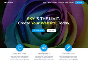
 Have you ever landed on a blog and immediately felt a certain vibe? Maybe it was energetic, serene, or even unsettling. A lot of that comes down to the colors used in the blog design. I’m going to unpack the significance of color psychology in blog design and why it plays a pivotal role in how readers perceive your content.
Color isn’t just an aesthetic choice— it goes much deeper. It’s about harnessing the power of colors to evoke emotions and actions from your readers. You’re going to find out about the subtle yet powerful ways colors can influence behavior, engage visitors, and potentially even boost conversions.
This isn’t just about slapping some pretty shades on your website. It’s also about creating a cohesive and strategic experience that aligns with your blog’s message and goals. And let me tell you, when used wisely, color can become one of your strongest allies in building a successful online presence.
So, if you’re ready to learn more about the colorful tools at your disposal and how to use them effectively in your blog design, keep reading. We’ll dive right into the foundations of the color wheel and how it forms the basis of color selection in the next section.
Exploring the Color Wheel: A Blogger’s Palette
Imagine the color wheel as a roadmap guiding you through the world of visual harmony. It’s a tool that artists and designers have relied on for centuries to create visually appealing compositions. For bloggers, understanding the basics of the color wheel can make a significant difference in how you choose colors for your blog’s design.
At the heart of the wheel, you’ve got the primary colors: red, blue, and yellow. These colors can’t be made by combining others. They are the foundation from which all other colors are derived. Then there are the secondary colors—orange, green, and purple—created by mixing equal parts of two primary colors. And let’s not forget the tertiary colors, those resulting from mixing a primary color with a secondary color, giving us hues like yellow-orange and blue-green.
When it comes to creating a pleasing color scheme for your blog, color harmony is key. That might be analogous colors, which are next to each other on the wheel and can offer a serene and comfortable design, or complementary colors, opposite each other, offering a vibrant look if you’re aiming for high energy. Triadic schemes, using three evenly spaced colors on the wheel, can be another dynamic choice.
Remember, your blog’s color palette isn’t just about aesthetics, it’s about communication. The colors you choose have the power to instantly convey a feeling or message to your readers before they even read a word. So you want to make sure those first impressions count.
Understanding Color Meanings and Associations
You’re going to find out about the fascinating world of color meanings and associations. Color isn’t just a visual element; it carries psychological weight that can convey messages and evoke emotions without a single word.
Culturally, colors have varied meanings across the globe, for instance, while white typically represents purity in Western cultures, it can symbolize mourning in some Eastern cultures. Red, often associated with passion and energy, can also signify danger or debt, particularly in financial contexts.
On an emotional level, colors can profoundly impact how we feel. Blue can have a calming effect, promoting a sense of serenity and trust, which is why it’s frequently used in healthcare and technology sectors. Yellow, radiating brightness and vitality, can stimulate cheerfulness and mental activity, making it a potent color for call-to-action buttons or areas on your blog where you want to draw attention.
Don’t worry too much about memorizing every possible meaning; instead, focus on the common associations in your particular context. If you want to create a sense of luxury and elegance, you might lean towards blacks, deep purples, or metallic tones. For a health or sustainability blog, greens reflect growth and vitality.
You can always adjust your approach down the road, but grasping these emotional and cultural nuances will give you a sound basis for selecting the right colors that resonate with your blog’s message and your audience.
So, that brings us right into the next section. When you’re choosing colors for your blog, how do you make sure they’re the right fit for your blog’s theme, mission, and audience? Here’s how.
Selecting the Right Colors for Your Blog
I’m going to show you exactly how to pick the colors that will make your blog pop. This isn’t just about choosing your favorite shades; it’s about strategic selection that speaks to your blog’s heart and soul, and to your audience.
First up, consider the main theme and purpose of your blog. Are you doling out advice on wellness? Then you might lean towards soothing blues and greens. If you’re pounding out content in the tech space, sleek blacks or modern blues could be more your speed. Your aim is to align the vibe of your color choices with the message you want to convey.
Now, what about your audience? Who are they? Young, avant-garde artists, or busy professional parents? Choose something that resonates with them. Vibrant, saturated colors might energize a younger crowd, while more subdued, neutral tones could appeal to a professional demographic. Remember, you’re not just decorating a space; you’re conversing through color.
Achieving balance and readability is crucial—it’s the linchpin of engagement. Jarring contrasts can be as off-putting as a poorly composed symphony. You want to find that sweet spot. A combination of dark text on a light background usually works best for readability. However, if you want to go bold with a dark theme, ensure your text pops without straining the eyes.
Lastly, don’t be afraid to stand out with a unique palette, but know that consistency is your friend. Readers should get a familiar feel every time they visit your blog, not a visual jolt because you change colors like you change socks. Stick with it; brand recognition and color consistency go hand in hand.
Psychological Effects of Color on Audience Engagement
I’m going to show you how the colors you choose for your blog can do more than just make it look pretty. They can actually play a significant role in how your audience interacts with your content. Different colors can subtly influence a reader’s mood, energy levels, and ultimately their engagement with your blog.
You might find it fascinating that blue can convey a sense of trust and calm, well-suited for a blog focusing on wellness or finance. On the flip side, red can evoke excitement and urgency, great for a blog with calls to action, like ‘Subscribe Now!’ or ‘Sale Ends Today!’.
But it’s not just about picking a color that matches your message. The way colors are combined and where they’re used can guide readers to specific sections, highlight important information, and make navigation intuitive. Think of color as a silent guide, nudging your readers where to click next.
Consider a story from a popular tech blog. By changing their ‘Subscribe’ button from a cool green to a vibrant orange, they saw a 32% increase in sign-ups. It’s clear evidence that the psychology of color isn’t just theory; it can yield real, measurable results.
Now you might wonder, how do you apply this to your own blog? Start with your most desired action: Do you want more comments, shares, or sign-ups? Choose accent colors that promote those actions and strategically pepper these hues throughout your site.
Designing for Accessibility: Color Choices That Include Everyone
If you’re going to make an impact with your blog, it’s crucial to consider every reader, including those with vision impairments. Color choices can be a significant barrier for many, so let’s focus on making inclusive decisions.
You might be surprised to find out how common color vision deficiencies are. Roughly 1 in 12 men and 1 in 200 women worldwide are colorblind, which doesn’t just affect how they enjoy games or art but also how they take in information online. So when we talk about color psychology, we’re also talking about accessibility.
While it’s tempting to go bold with vibrant hues, remember that some of your readers may not perceive these colors the way you intend. Instead, aim for high contrast color combinations that distinctly differ from one another, making your content legible for everyone.
In my opinion, it’s not only about compliance with standards, but also about empathy and understanding your audience. The Web Content Accessibility Guidelines (WCAG) are a great place to start. They provide clear instructions on color contrast ratios needed to ensure readability.
So, how can we test color accessibility? Luckily, there are numerous tools – many of them free – that allow you to check your blog’s color scheme against these guidelines. You can always adjust your approach down the road based on real-world feedback from your audience, too.
Your first attempt doesn’t need to be your last. Testing and iterating are part of the design process. Once you choose accessible colors, you’ll want to integrate them into your branding consistently, which we’ll dive into next.
Integrating Color Psychology into Your Blog’s Branding
Incorporating color psychology into your blog’s branding isn’t just about picking the most eye-catching hues; it’s about creating a consistent message that resonates with your audience. Your color choices can be a tool to build recognition and encourage trust in your content.
The process starts with defining your brand identity. Who are you as a blogger? What values and messages do you want to convey? Choose colors that communicate these aspects. If you’re all about energy and excitement, consider vibrant reds or oranges. If you prefer to project calm and trust, blues might be your allies.
Consistency is the backbone of brand recognition. From your logo to your blog headers and buttons, maintaining consistent color use can leave a strong imprint in your readers’ minds. This consistency should also be reflected across all your digital touchpoints, such as your email newsletters and social media profiles.
As the seasons change, so do people’s preferences. Incorporating seasonal color trends can keep your blog looking fresh. Just remember to stay true to your brand’s core identity. A splash of seasonal color can captivate your audience without compromising the foundational color scheme.
Lastly, don’t lock yourself into your first choice. Your blog is a living part of your brand, and as it grows, your understanding of your audience might lead you to tweak your colors. This part of your brand’s journey is not just acceptable, it’s expected as you hone in on exactly what engages your audience the most.
Conclusion: Continuing Your Color Journey in Blog Design
I hope this journey into color psychology for your blog design isn’t just a fleeting visit but the start of a beautiful, ongoing relationship with color. You’re armed now with the knowledge of how colors impact reader behavior, which hues could trigger the desired response, and the importance of being inclusive in your color choices.
Remember, the colors you’ve chosen today don’t have to be your final palette. The beauty of a blog is its flexibility. You can always adjust your approach down the road based on the feedback from your audience and the insights from your analytics.
Choose something that resonates with you and your brand, but don’t worry too much about getting it perfect the first time. Keep an eye on how your readers interact with your content, and don’t be afraid to tweak and test new combinations. After all, your first attempt doesn’t need to be your last.
If you want to stay ahead of the curve, it’s important to keep learning and experimenting. A lot is happening very quickly in the world of web design, and staying informed means you’re always ready to adopt new trends that could enhance your blog’s experience.
I really hope that you’ve found this exploration into color psychology both enlightening and actionable. Today, I’ve shared with you a strategy that I like to leverage, but it’s your turn now to paint your digital canvas. And remember, I’m here to help you with any questions you might have along the way. Thanks for joining me, and I’d love to hear your feedback, so feel free to leave your comments and share your color successes!