
 I’m going to kick things off by exploring what it means to have a user-friendly website layout. This isn’t just about making a site look pretty; it’s about creating an environment where users can find what they need quickly and without frustration. In the realm of web design, ‘user-friendly’ combines the art of visual appeal with the science of easy navigation.
You’re going to find out about why it’s crucial to prioritize both accessibility and simplicity in your design. And it’s not only for the sake of your visitors—it also ties back to Google’s E-E-A-T guidelines. These principles emphasize a user-centric approach to create a trustworthy and authoritative site that search engines love to rank well.
So what does all this mean for you? If you want to build a website that caters to the real needs of your audience, you’ve got to have a clear understanding of who they are and what they’re looking for. Only by integrating this knowledge into your design can you truly make a user-friendly website.
With that foundation set, I’m going to lead you into the next crucial step: laying the groundwork with purpose and planning. This includes getting to grips with your site’s core purpose, recognizing who your users are, sketching out your site’s blueprint, and setting tangible targets for user experience. And remember, your first attempt doesn’t need to be your last; there’s always room for refinement.
Laying the Foundation: Purpose and Planning
I’m going to show you how to kick-start your website with a clear understanding of its purpose and a well-thought-out plan. This isn’t just about having a beautiful website, it’s also about making sure it does exactly what you need it to do.
You’re going to find out about determining your website’s core purpose first. Ask yourself what you want your website to achieve. Is it to inform, to sell, or maybe to entertain? Each goal necessitates a different design approach.
Understanding who will use your site is equally vital. Are they young tech-savvy users, or are they less familiar with digital interfaces? Cater your design to their expectations and behavior for a personalized experience that resonates with them.
Creating a blueprint of the site’s structure is next. This means organizing your content into pages and sections before any actual design work begins. It saves you time in the long run and ensures a coherent flow of content.
And don’t forget about setting realistic goals for user experience. Great design is an iterative process, and your first attempt doesn’t need to be your last. Establish benchmarks for success and plan for ongoing improvements.
Navigational Design: Crafting Intuitive Menus
An effective navigational structure is like a good map; it guides visitors through your website with ease. When users can find what they need without frustration, they’re much more likely to stick around. Clear navigation can be the difference between a quick exit and a satisfying experience.
To start, your menus should reflect a logical flow. Think about the way departments are arranged in a store – similar items are grouped together; it should be the same on your website. When you’re setting up your menu, group related pages under coherent categories. This isn’t just about user convenience, it’s also about providing a structure that search engines can easily understand and index.
Breadcrumb trails are another navigational tool you can use to enhance the user experience. These provide a trail for users to follow back to where they started, and they’re especially effective for websites with multiple layers of content. Breadcrumb trails help users navigate your site without hitting the ‘back’ button incessantly, which is a plus for both usability and SEO.
Finally, never compromise on mobile responsiveness. With the increasing use of smartphones to access the internet, your menu must function flawlessly on different screen sizes. Ensure that touch targets are easy to press and that your menu isn’t cluttered on small displays. Good navigational design is responsive design. By keeping these points in mind, you’ll set up a navigational structure that’s both user and SEO-friendly.
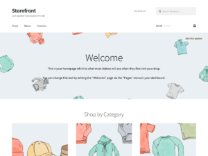
Aesthetic and Functional Layout
Creating a website layout that’s pleasing to the eye and easy to use doesn’t have to be a daunting task. In my opinion, there’s a sweet spot where aesthetic appeal meets functionality, and that’s exactly what you want to aim for. This isn’t just about looking good; it’s also about creating an environment where your users feel comfortable and can find what they need without hassle.
The visual appearance of your site is often the first impression users will have, so choosing a color scheme and font that resonate with them is vital. You’re going to find out about the psychology of color and how it can influence user behavior. Similarly, the font choice should not just reflect your brand’s personality, but it must also be legible across different devices and resolutions.
White space is your friend. It’s not empty, useless space; it’s a powerful design element that can help reduce clutter and focus the user’s attention on what matters most. A clean layout with ample white space can enhance user experience by making your content more digestible. Users often appreciate not feeling overwhelmed when they land on a page.
And what about those images, videos, and animations? They’re fantastic for engagement, but moderation is key. If you want to incorporate multimedia elements without causing distraction or slow load times, be strategic. Opt for high-quality media that serve a purpose, and remember that every addition to your page should support your message, not overshadow it.
Content Hierarchies: Guiding the User’s Eye
Imagine walking into a library where books are scattered haphazardly. Overwhelming, right? That’s how users feel when website content lacks a clear hierarchy. In my experience, designing an effective content hierarchy isn’t just about aesthetics; it’s about creating a roadmap that guides the user’s eye through the information effortlessly. Now, what is the visual hierarchy? It’s the arrangement of elements in a way that signifies their importance.
You’re going to find out how to use headings, subheadings, lists, and bullet points to differentiate sections and pinpoint essential elements. Think of headings as signposts that tell users where to go next. Lists and bullet points? They break down complex information into bite-sized, easily digestible chunks. Plus, they’re a godsend for skimmers.
CTAs are your best friend when you want to prompt action. Placement, size, and contrast can make your CTAs stand out, but remember not to overshadow the content they’re meant to amplify. A tip from my playbook: Keep CTAs clear, concise, and compelling to increase the odds of user engagement.
And here’s a fascinating bit: Did you know users typically scan web pages in an ‘F’ pattern? That means their attention often starts at the top-left corner and then scans downward on the left side, making strategic placement on the page critical for your key content. It’s pretty wild how much these small changes can enhance user experience.
Now as we’ve unraveled how to direct the user’s gaze, it’s crucial to ensure that the layout doesn’t just look good but is accessible to all. In the next section, I’m going to cover accessibility and inclusivity in web design, ensuring you’re crafting a user-friendly experience that reaches every individual, no matter their abilities.
Accessibility and Inclusivity: Design for Every User
I’m going to walk you through the critical topic of accessibility and inclusivity. This isn’t just about following best practices; it’s about ensuring everyone can use your site, regardless of their abilities. So, how do you go about creating a website that is truly accessible to all?
First things first, familiarize yourself with the Web Content Accessibility Guidelines (WCAG). These are the international standards for making web content more accessible to people with disabilities. They cover a range of recommendations for making web content more accessible, focusing on aspects such as providing text alternatives for non-text content, making it easier to see and hear content, and ensuring user control of time-sensitive content changes.
When designing for inclusivity, it’s important to cater to screen readers and other assistive technologies. That means ensuring your site’s code is well-structured with semantic HTML. Use header tags correctly, label forms properly, and provide text descriptions for images (alt text) so that screen reader users can navigate and understand your content.
Inclusivity also means considering users with different types of color blindness when choosing your color schemes. Ensure there is sufficient contrast between text and background colors and avoid using color as the only way to convey information. Tools like color contrast analyzers can help you here.
Lastly, don’t forget to offer flexibility in user preferences and settings. Allow users to adjust font sizes, pause animations, and opt for a more readable page layout if needed. Remember, a user-friendly website adapts to the user, not the other way around.
Next, you’re going to find out about optimizing website performance. You’ll see why the speed at which your website loads is crucial not just for maintaining user attention, but also for improving your search engine rankings. We’ll explore how to keep your website running like a well-oiled machine, which is key to a seamless user experience.
Optimizing Website Load Times and Performance
You’re going to find out about optimization—specifically, how it’s critical for maintaining a user-friendly website. We’ve all been there: a website takes forever to load, and you just can’t help but lose interest. This isn’t just about a slight inconvenience; it’s also about the massive impact on user experience and your site’s search engine ranking. Here’s how to keep things speedy.
Minimizing HTTP requests tops our list. Most of a webpage’s load time is spent downloading different parts of the page: images, stylesheets, scripts, and more. By reducing the number of elements on your page, you can lessen the number of HTTP requests required for a page to render. This can be achieved by simplifying design elements, combining style sheets, and using CSS instead of images when possible.
Choosing the right web hosting is like selecting a home for your website. If the foundation isn’t solid, everything built atop it might crumble. You’ll want hosting that offers not just space, but also speedy and reliable service. Consider the server’s location relative to your audience, the types of drives used by the host (SSD is faster than HDD), and the resources allocated to your website.
Regular updates and maintenance are the equivalents of a health check-up for your website. Just as we keep ourselves in good shape to stay active, your website needs ongoing care to stay fast and relevant. Updating content management systems, plugins, and scripts can shield against slow downs and security vulnerabilities.
I really hope that you’re seeing how these strategies connect to the big picture. As you smooth out the kinks in your website’s load time and performance, you’re setting the stage for the final touch—feedback. And that’s what I’m going to talk about next—how to bring your user-friendly vision full circle by incorporating real-world user feedback into an ongoing cycle of improvement.
User Testing and Feedback: The Continuous Improvement Cycle
Creating a user-friendly website isn’t a one-and-done task; it’s an ongoing process that hinges on user engagement and iterative design. That’s where testing and feedback come into play, and I’m going to walk you through why they’re indispensable to your website’s long-term success.
I can’t stress enough the importance of A/B testing. By comparing different layout versions, you’re able to make data-informed decisions that enhance user experience. Don’t worry too much about getting everything perfect on the first try. Your website will evolve as you learn what resonates with your audience.
User feedback is pure gold. Whether it’s praise, criticism, or suggestions, this information is paramount for growth. I encourage you to create avenues for users to share their thoughts and show that you value their input by acting on it. Remember, choose something that aligns with your user’s comfort—simple surveys, feedback forms, or even direct dialogue can work wonders.
Monitor user behavior with analytics tools to understand how they interact with your website. This includes pinpointing where they spend the most time, what they click on, and where you might be losing their attention. Analytics can offer a wealth of insight, but it’s your job to translate that data into action.
I’m a big believer in the power of periodic reviews and updates. The digital landscape is always changing, and your website must adapt to stay relevant and engaging. This doesn’t just maintain your user-friendly status—it escalates it.
Building a user-friendly website is much like maintaining a thriving garden. It takes patience, dedication, and regular tending. You plant the seeds with a strong foundational layout, water it with great content, and prune it with user feedback. Over time, you’ll watch it grow into a site that not only attracts visitors but delights them, encouraging their return.
I really hope that this guide has equipped you with the knowledge to transform your website into a more user-friendly space. With these strategies, I’m confident that you’re well on your way to creating a website layout that is not only visually appealing but also intuitive and inclusive for all who visit. And when that happens, guess what? You’re going to see outcomes that exceed your expectations.